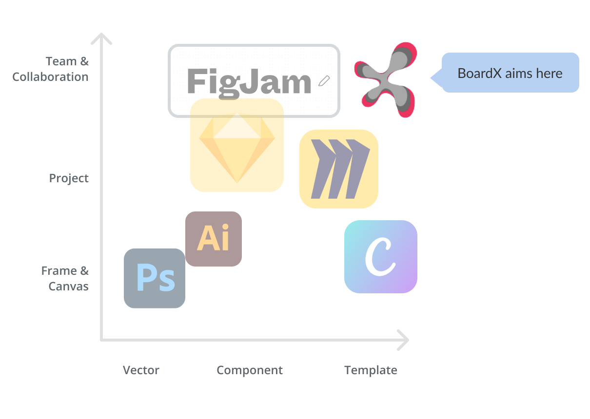
One of the largest source of virtual events platform’s market entropy is the intersections of specific customer need. BoardX is trying to align their business goal with customer needs the has barely meet: combination of Template and Collaboration.
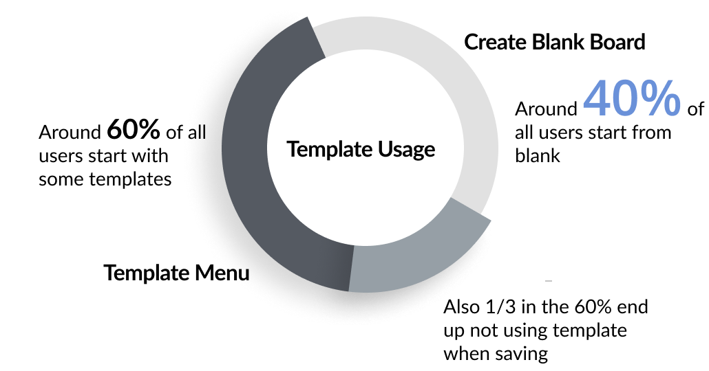
Although BoardX’s is trying to grow in the market segment of collaborative template. The rate of template usage is not as high as expected.
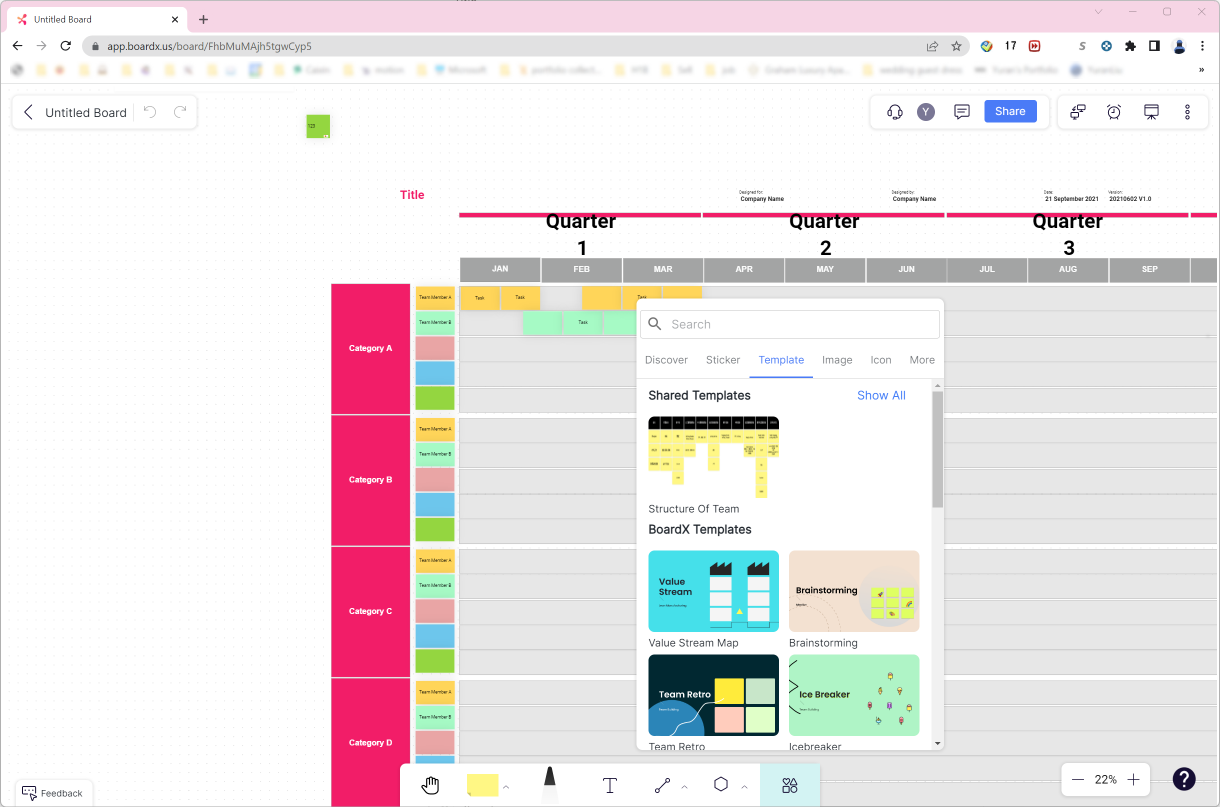
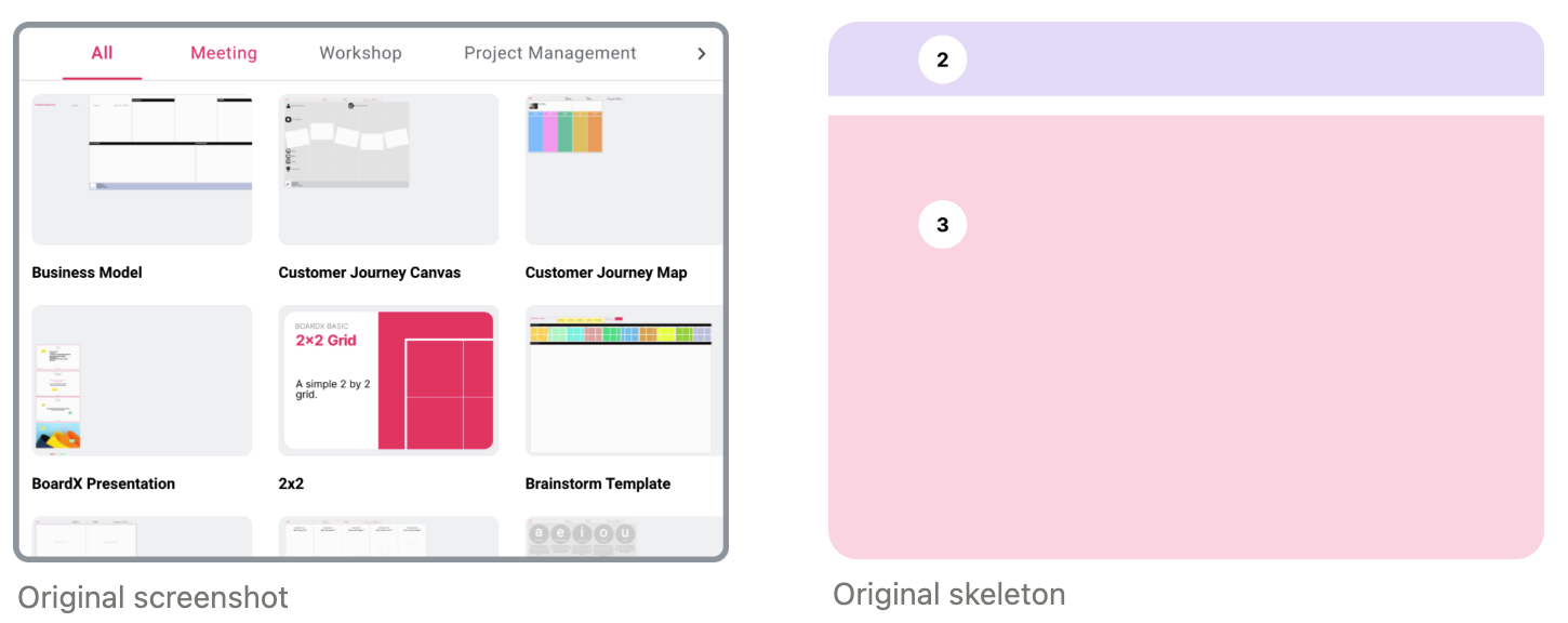
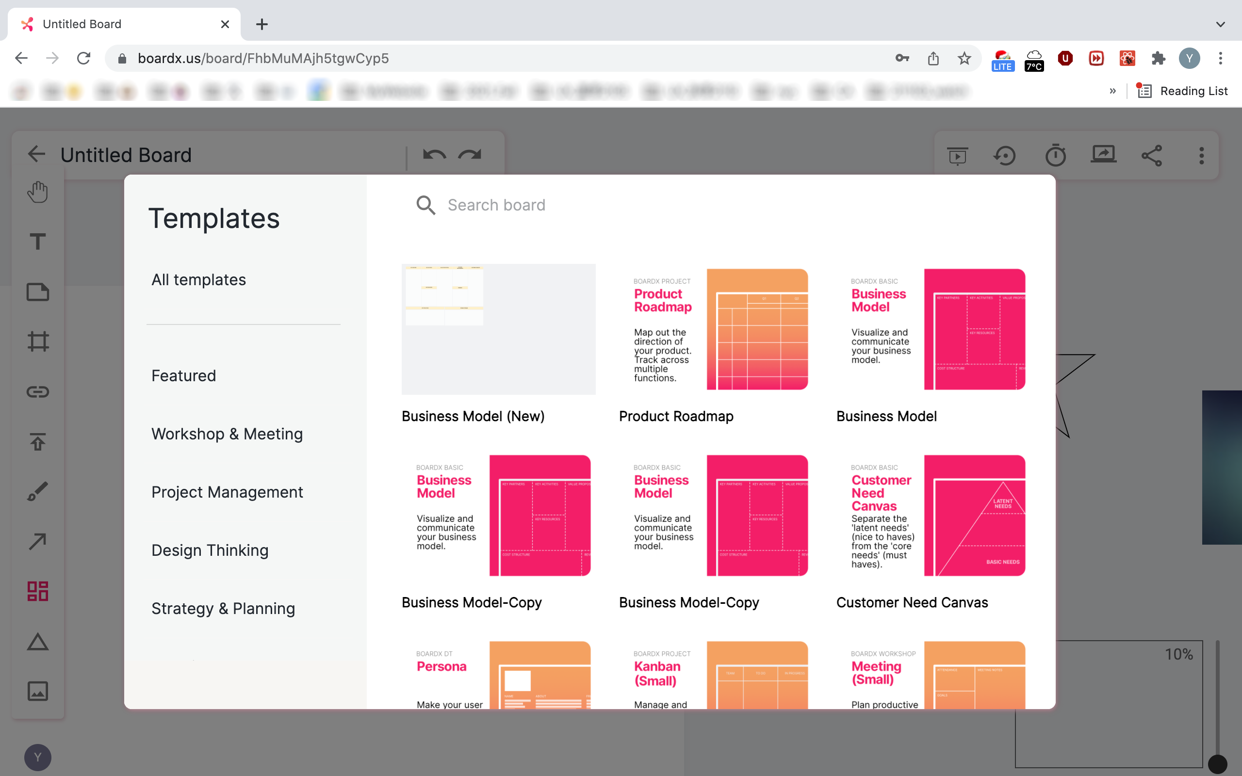
This following was a screenshot of BoardX’s template library selection window. We observe relative long scrolling and choosing time when an interviewed user going through the template library.
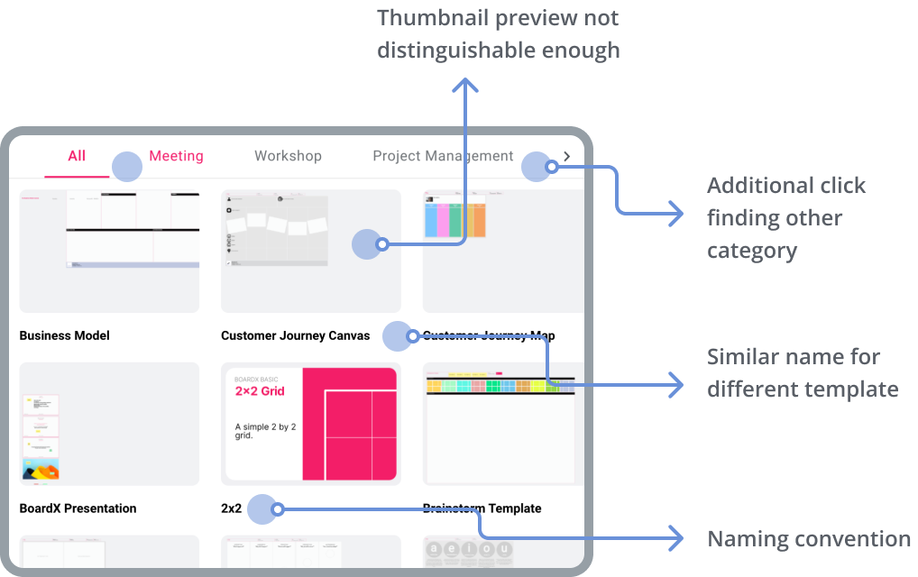
Interviews user also tend to drop off when browsing the template library. When they sense confusion in operation process, they give up search and then turns to a blank canvas or seek other app to achieve their wanted task.
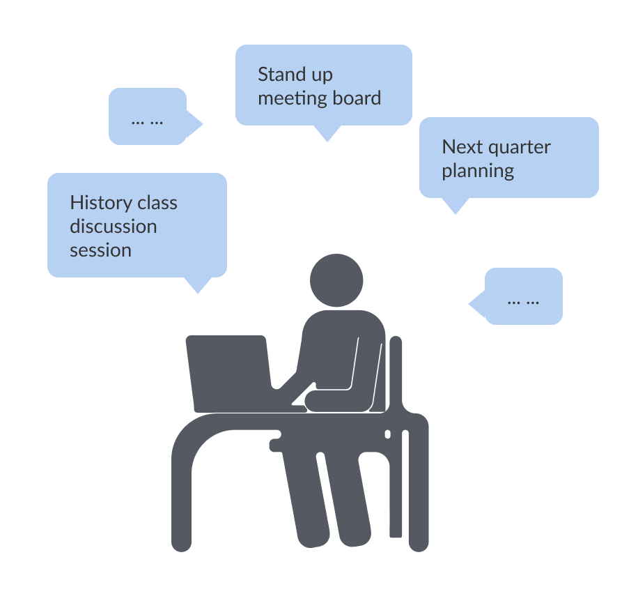
During our design research and interviews, we find that user usually have a very clear and specific goal in mind when using theses productivity tools. It is the gap between what user want and what the template library show making these low rate.
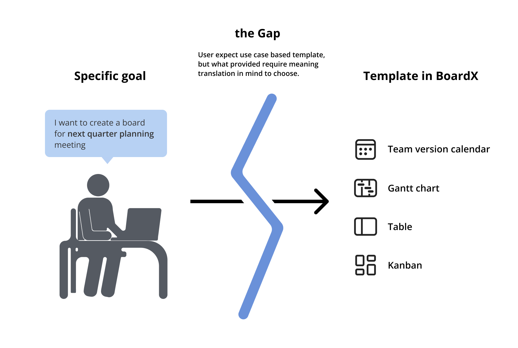
Specific Goal: Team Agenda Planning Meeting
BoardX Template Library: Team Calendar? Gantt Chart? Team Alignment? Lean Coffee? Next Kickoff?
Meaning translation: I think I can use Gantt chart template for team planning meeting.
🧐 How might we help users choose the most suitable template they want according to their specific task goal?
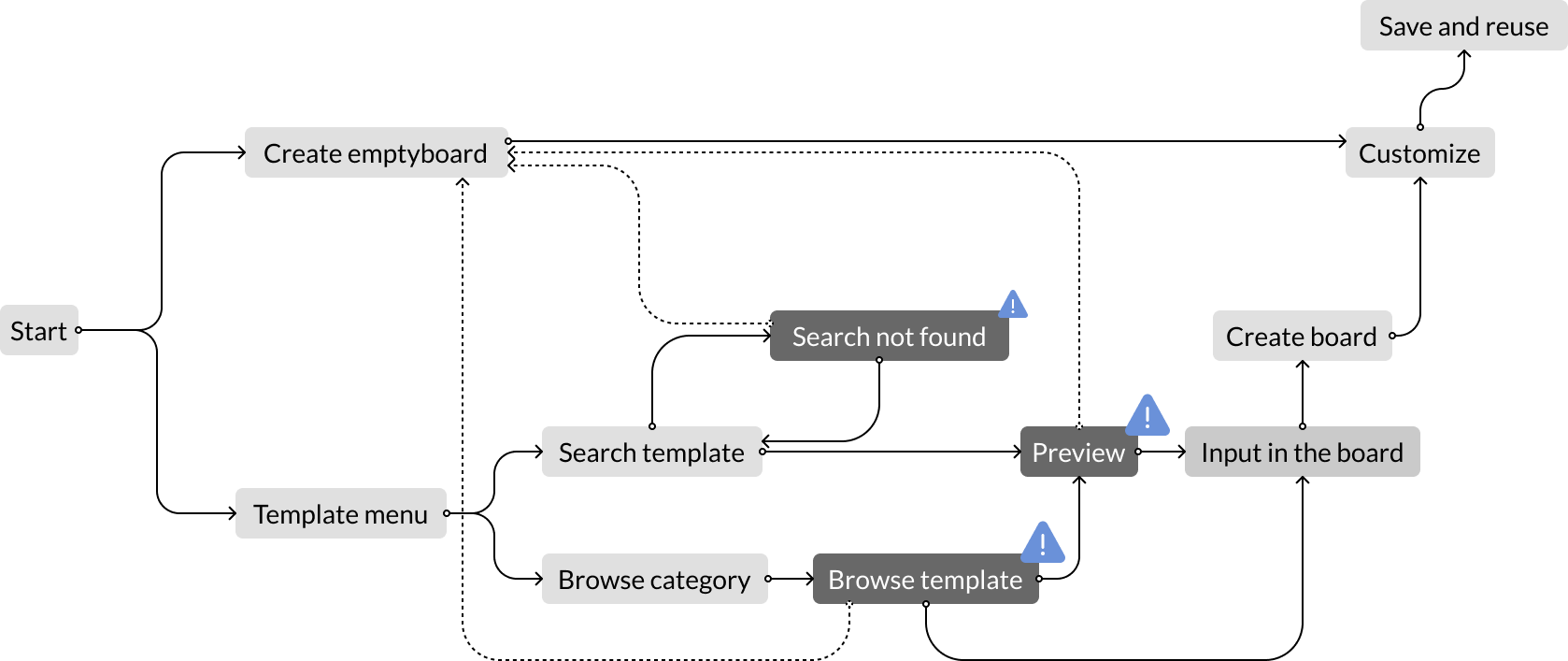
Users go through the template gallery and choose a template to add in the board. We can potentially dive into this angle.
Users can also search for what they want to use or to do in search bar to get a result.
SEO solution can be something for consideration for the future to help draw people in using BoardX. We will be focusing on the internal template use ecosystem in this round of update.
Here are three major information or interaction chunks to show in the template library window.
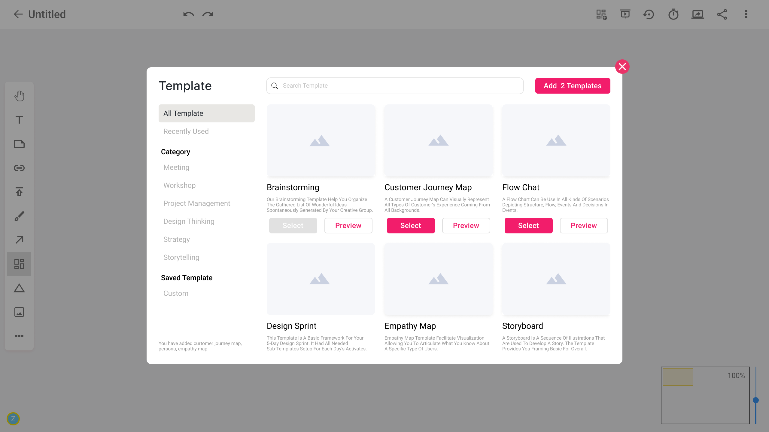
The original template window does not include a research function. We decide to add search feature in to help user locate what they want more directly.
Taking it further, for #2, category and quick access:

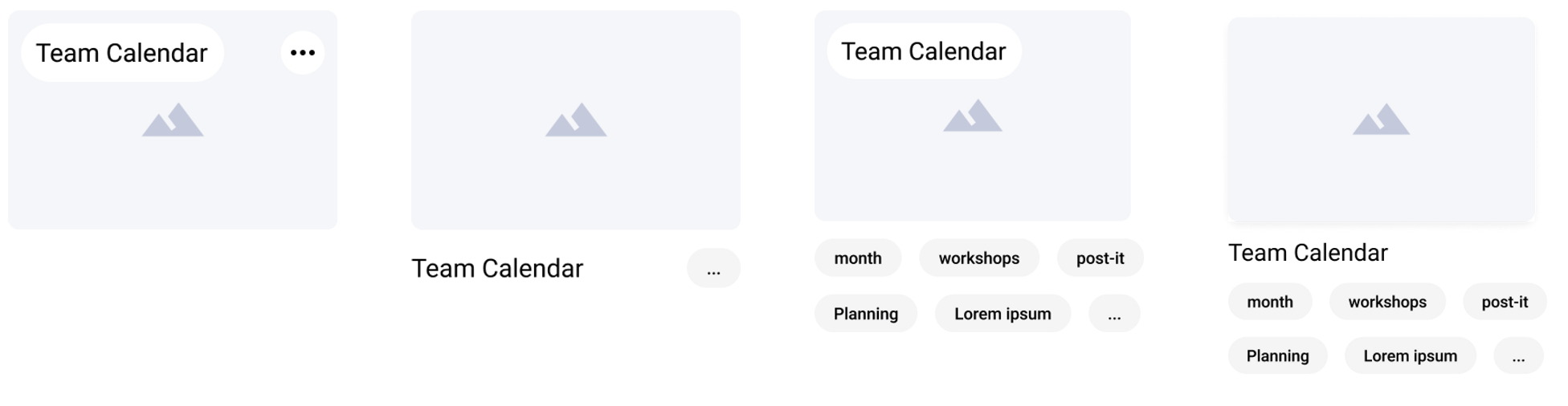
Text and preview content in template library are the most important part of reference when a user is skimming and scrolling through to find a template to use. Current gallery item include:
But are these two enough? Or are these two too much? Or is these two the right ones? The right combination?
🤨 What contents reference shall we provide to help users when selecting templates?
All the elements we are able to provide to help user choose:

After looking at couple of template example and evaluating each element, we decided to take out introduction. Think of the “5 second test”, we think part of being straightforward is designing to users know whether that is a suitable template at first glance.
🤔 What can we do more to help if the users is still not sure which one or when there are multiple potential choices?
We think it is not enough just scratching the surface interface and depend solely on contents. We want to take it further and to the upper level. We want to provide useful reassurance while not giving redundant information, extra steps, or additional click.
This solution pattern is relatively common and we also made a version of for lightweight usability testing, but we rule this out since user tends to spend a much shorter time in this frame if they are certain while if the user is not sure, he or she usually doesn’t tend to read such long text either
❌
This solution although did solve the problem of “not sure”. It also create additional clicks. And since it’s not that common, in template selection we see longer time when user entering this place to make selection.
Also according to Jakob’s Law,users spend most of their time on other sites. This means that users prefer your site to work the same way as all the other sites they already know.
❌
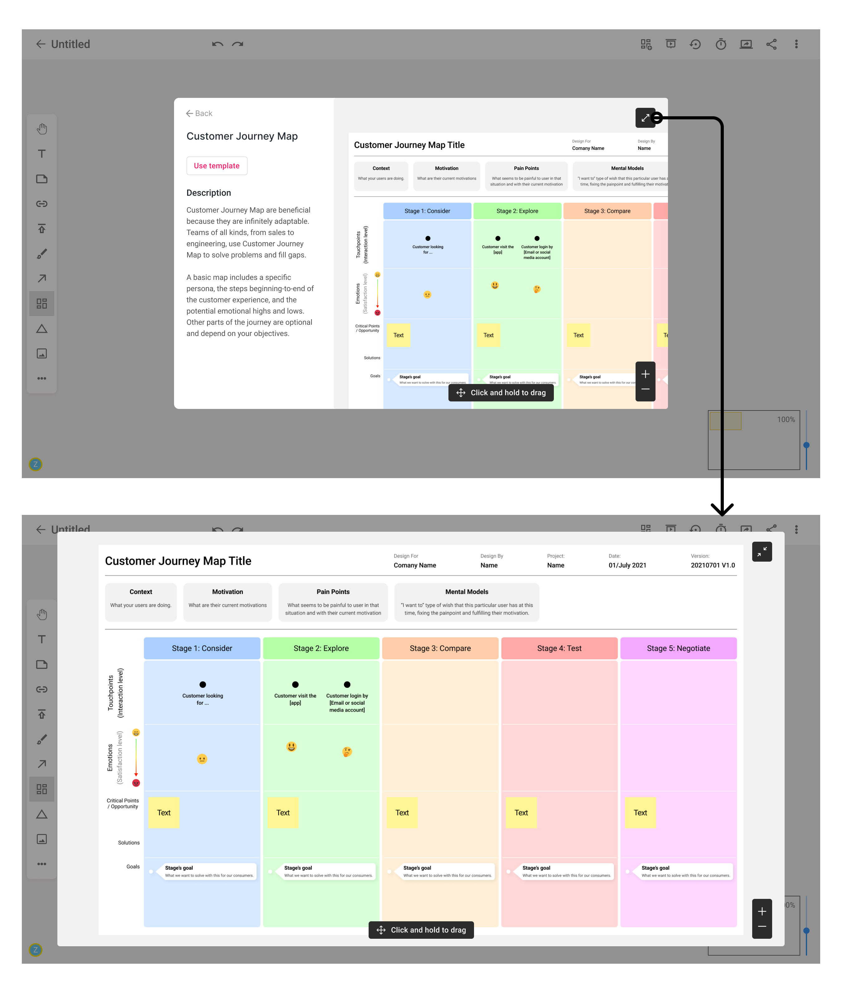
After choosing the template and entered board space, a side panel will appear, prompting related template. This help the vague selection and provide shortcut for changing template.
We decide to provide a floating window with related template information after user choosing a template in the board.
In this case, there is no extra clicks and information while also provided additional help as user getting into a board and a shortcut to exchange or add in more templates.
✅
Since this is a freelance capstone project, I left after a couple of month working with the team. I’m glad part of my design proposal has been implemented into BoardX in each round of releases. But also, I can see places where BoardX shift their attention which result in other associated design changes.
I reached out to ask about the user retention rate and template use rate information after this release since it had adapted our navigation layout design and content organization suggestion. I’m glad to hear there were improvements😆.
I assume due to FigJam’s big release BoardX is having a shift in their design as of today I created this case study. Major update were in board layout and navigation. Updates also happened in surface content preview thumbnail.