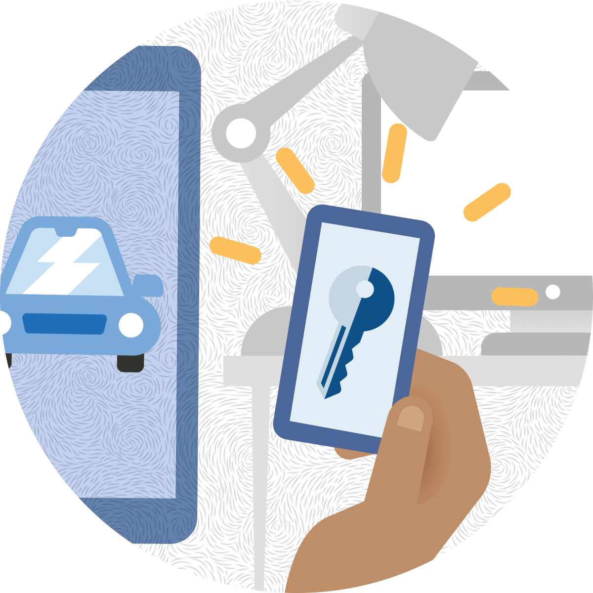
Google Android Automobile team has been using an internally developed Car Simulator App to mimic automobile behavior in order to test digital car keys in Android Wallet App. Nowadays, more and more car manufacturing companies start to migrate from the traditional physical car key to the new digital car key on customer’s mobile phones. The Android Automobile team decided to roll out this Car Simulator App for car manufacturing companies to use to test their digital car key during implementation.
In general, employees in car manufacturing companies which are Android business partners will use this app. More precious, users are development engineers, testing engineers, and product managers.
During work hours with extension for testing purpose, in office space, with a desktop/laptop.
Design the external version of the Car Simulator App for engineers in car manufacturing companies to test the digital car key during implementation.
Car simulator app is expected to be a compact and handy testing tool for testing digital car keys in the development process. Since users of this app have expert level knowledge on industry standard phrasing and technical skills, they are expecting to utilize this app without much user manual facilitating operation and understanding. How to let users know where to start and how to use the app at first glance?
In a systematic way of thinking, I approach giving design change suggestions from higher abstraction level to more detail and concrete level. Using the user experience pyramid thinking model and user interviews, I identified points that’s challenging to use.

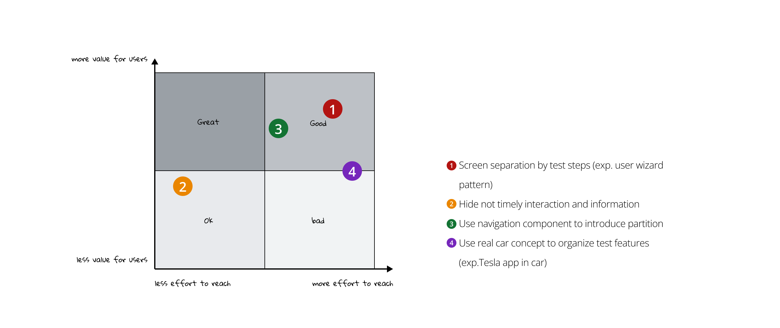
There are plenty of directions to approach non-hierarchical organization and spreaded layout issues. The general design principle guideline is progressive disclosure and group with contextuality.

There are plenty of options to achieve progressive disclosed testing app pages and grouping within an app test page.
1. Screen separation by test steps (exp. user wizard pattern)
2. Hide not timely interaction and information
3. Use navigation component to introduce partition
4. Use real car concept to organize test features (exp.Tesla app in car)
After evaluating reach and best value for users and discussion with the project group, I decided to move forward with 2+3 or 3+2.
Information Architecture Diagram
I utilize a step by step way to diagram out the intertwined relationship of user and app behavior to figure out what interaction and information need to be shown together on screen at the same time and what can be hidden and what other information can be reached by navigation.

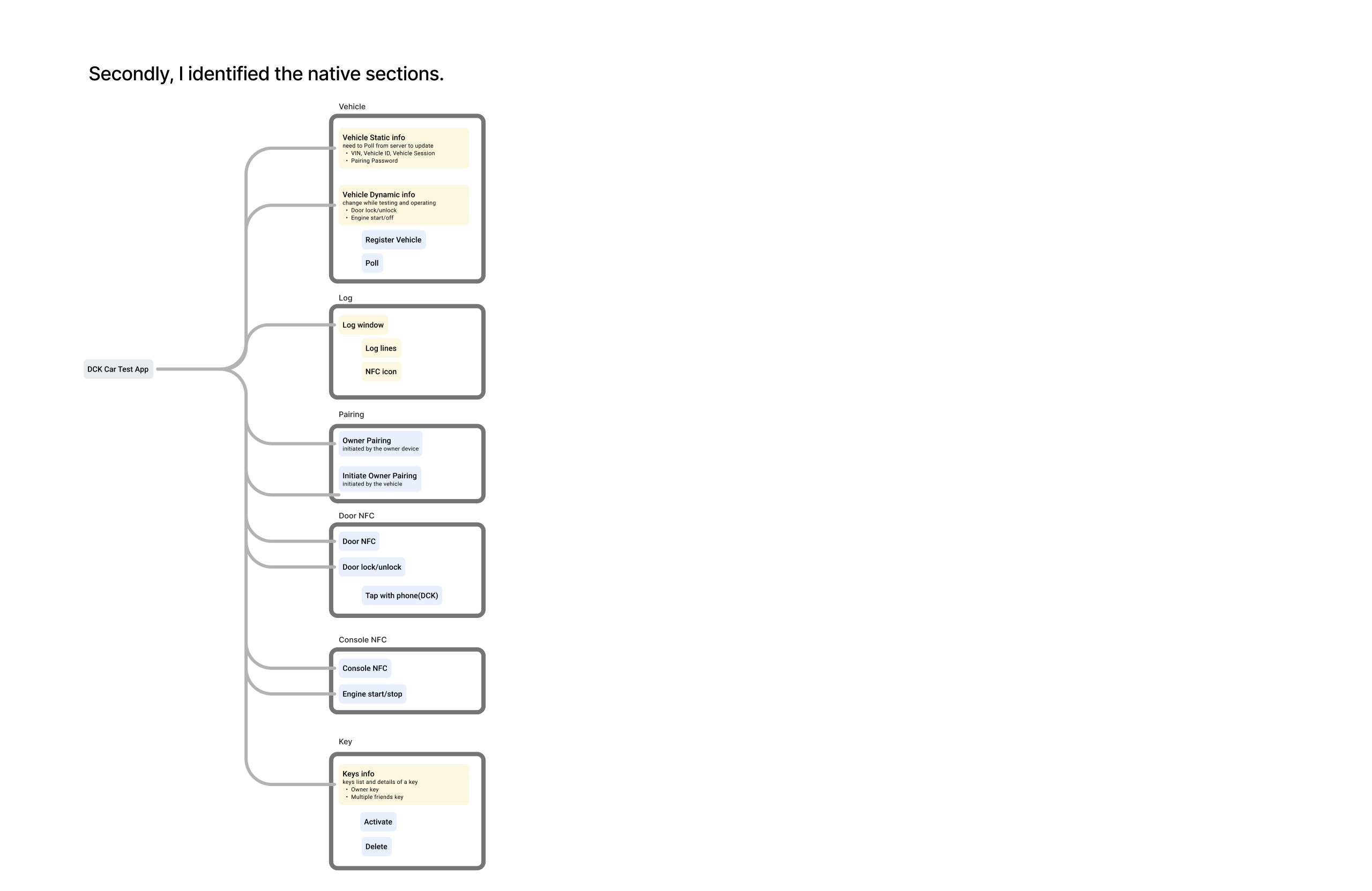


NOET: This is to show my process of thinking, for detailed reading please reach out and we can discuss!
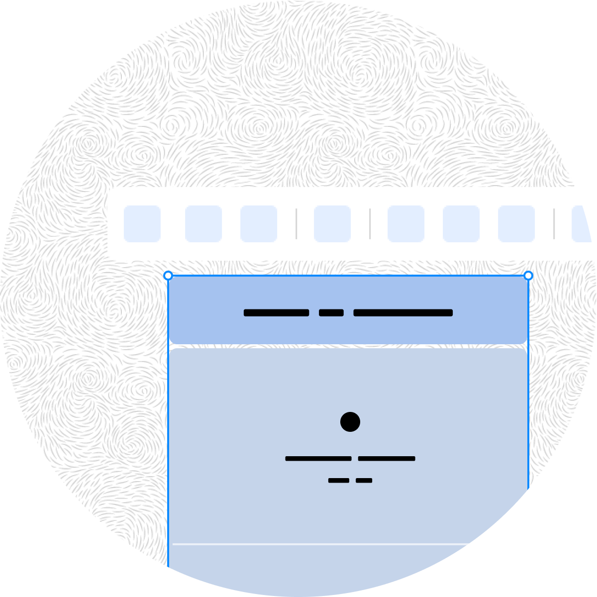
Low Fidelity Wireframe for Layout
With the IA diagram newly organized and grouping details identified. I am able to propose design options in wireframe to make decisions on the layout of the app.

After discussion with the Senior Designers in the project team,, I decided to go forward with option 1 single page, with more considerate grouping of interaction and information. Because this app is a compact tool in a work context, engineers who are using this app expect to get in and out this app as efficiently as possible. Navigation and separation in pages are valuable mobile design patterns but will also increase interaction cose, in this case, more clicks to operate a test. Showing all interaction and information in one screen would be a reasonable tradeoff in this use case.
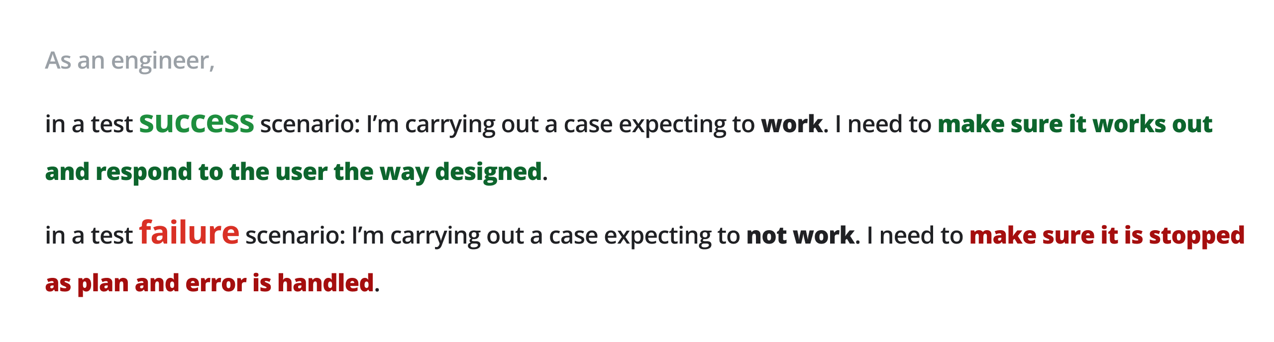
The special thing about testing is that both success and failure both need to be tested.
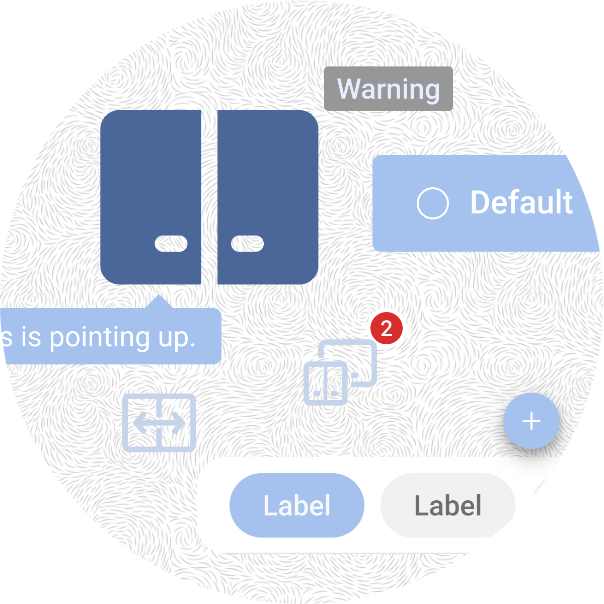
In the original Car Simulator App, there is an interactive component and information around car features. There are design issues on each part of this interaction. And it is also missing the failure information portion.
I went through different options to improve the clarity and relationship between interactive components and status information.

I then tried to craft the option furthermore.


However, after discussion with the project team we chose to move forward with a component that most aligned with the GM3 library and reached the final solution.
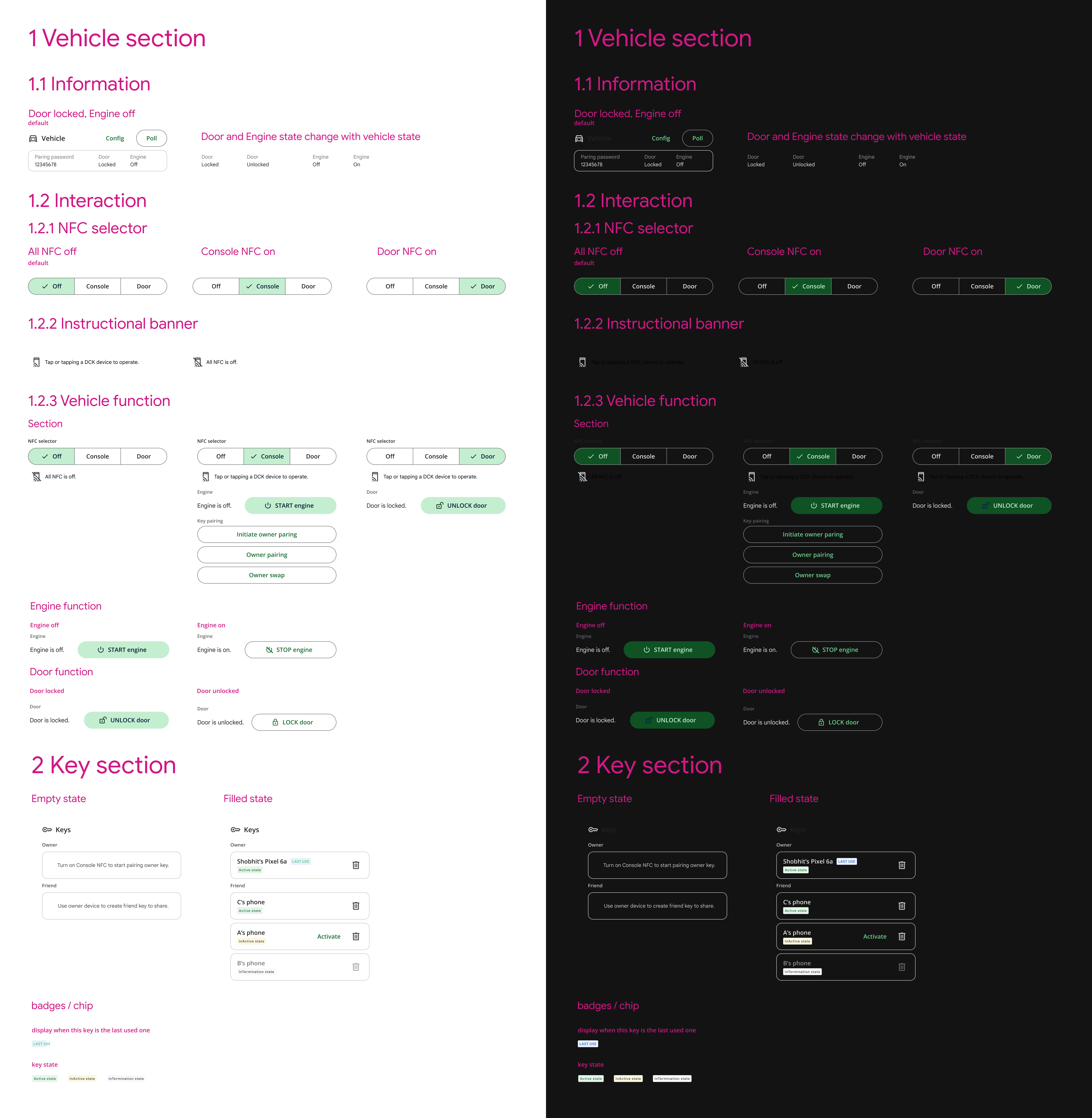
I delivered the final UX mock to implementation. The UX mock includes.
I reference Android Enterprise and Google Material 3 for visual design consistency.
I also composed component specs to includes different regular and empty states for implementation delivery.