Back in 2020 March, when COVID-19 just start, the pandemic turned every class, show, and meeting in school to virtual. Studio Jackson 2020 need to curate a show to present all thesis project just like every year before, BUT in virtual form. This lead to the question:
🧐 How might we curate a virtual show room?
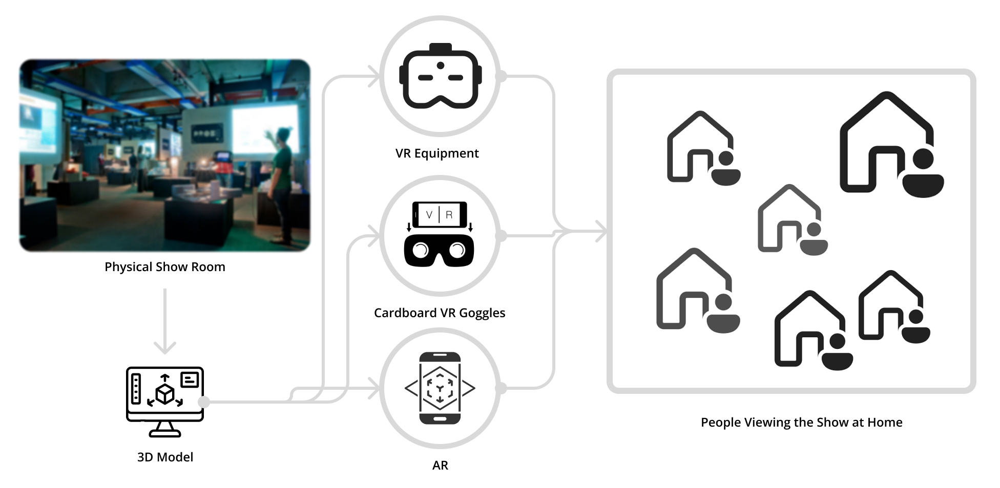
Our initial thought is to create a digital 1 to 1 copy of Cal Poly’s Paul & Verla Neel Resource Center (NRC), the physical space where previous thesis show presented. And use VR equipment, or phone panorama, or AR with some sound to make a replica for people sitting home to enjoy the thesis show.
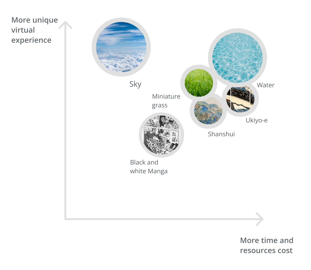
It came to us that we should not treat this virtual online experience as something that need to deliberately make it realistic. But, take advantage of this virtual form and curate a thesis show experience that a show in physical space cannot.
What is something that a real physical showroom in a building cannot do? Maybe diving in the ocean, flying in the sky, or even exploring a ranch in miniature size. But considering technology, resource, and time. We decided to go with a sky scene.
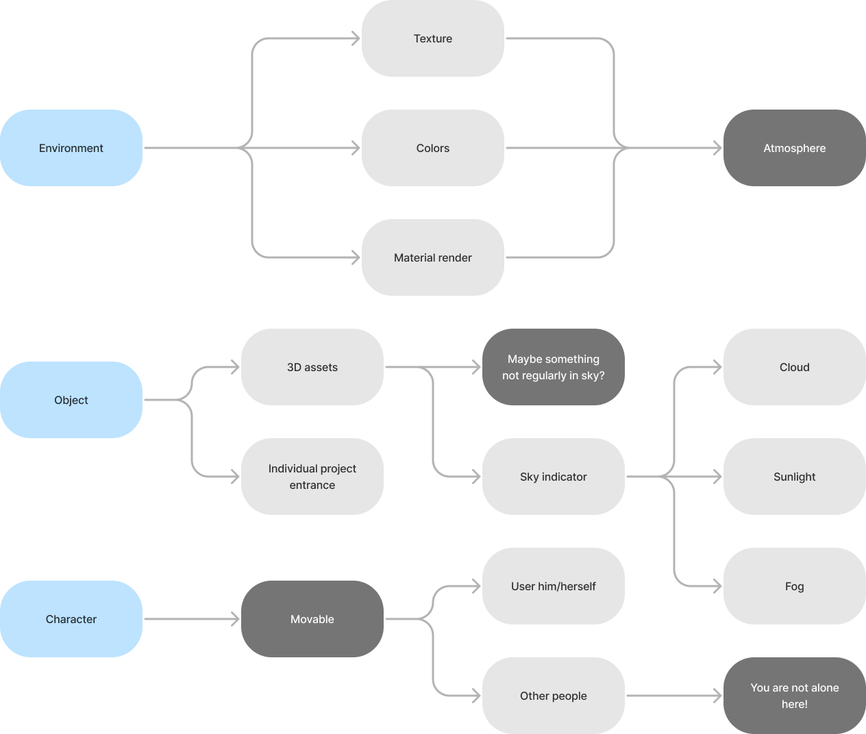
To create a immersive and exotics floating experience, we learnt from game aesthetic design and decided to prioritize the craft of the environment, objects, and characters.
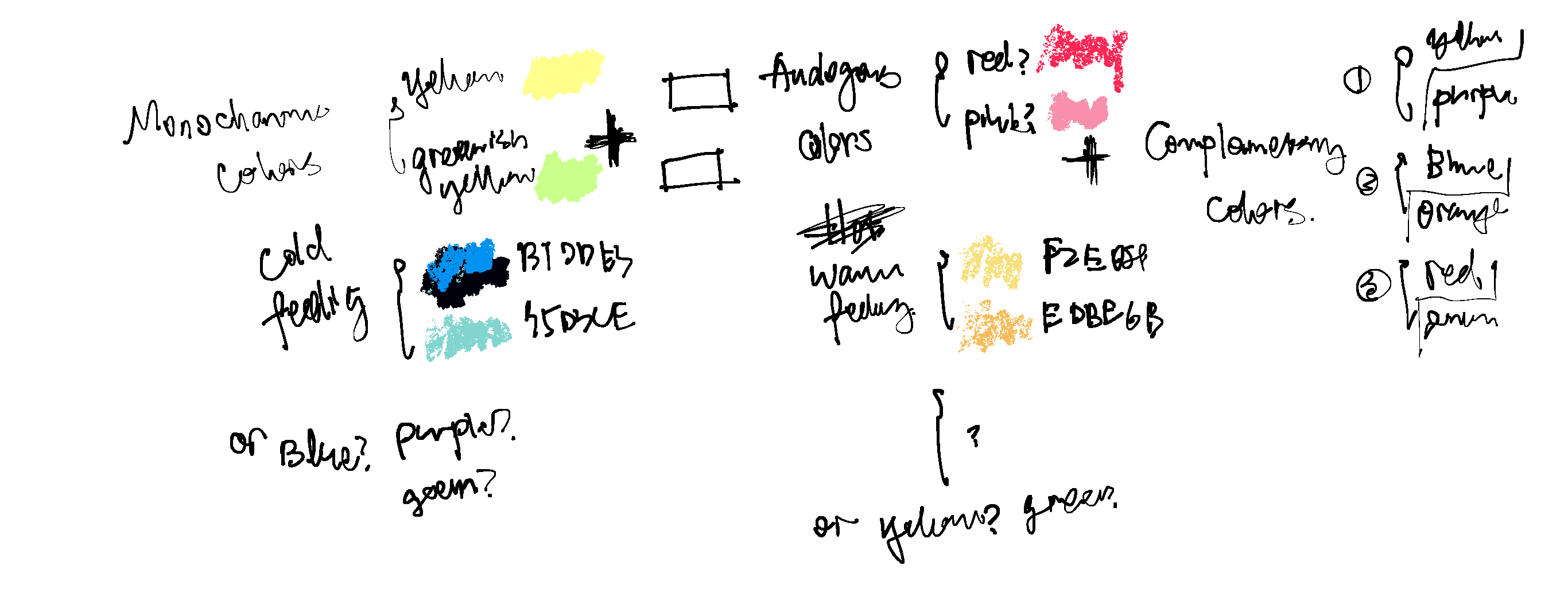
To get myself inspired, I looked up references and created color palettes for them. From studying the color palettes, I tried to summarize an equation to guide the overall colors for generic objects in Unity.
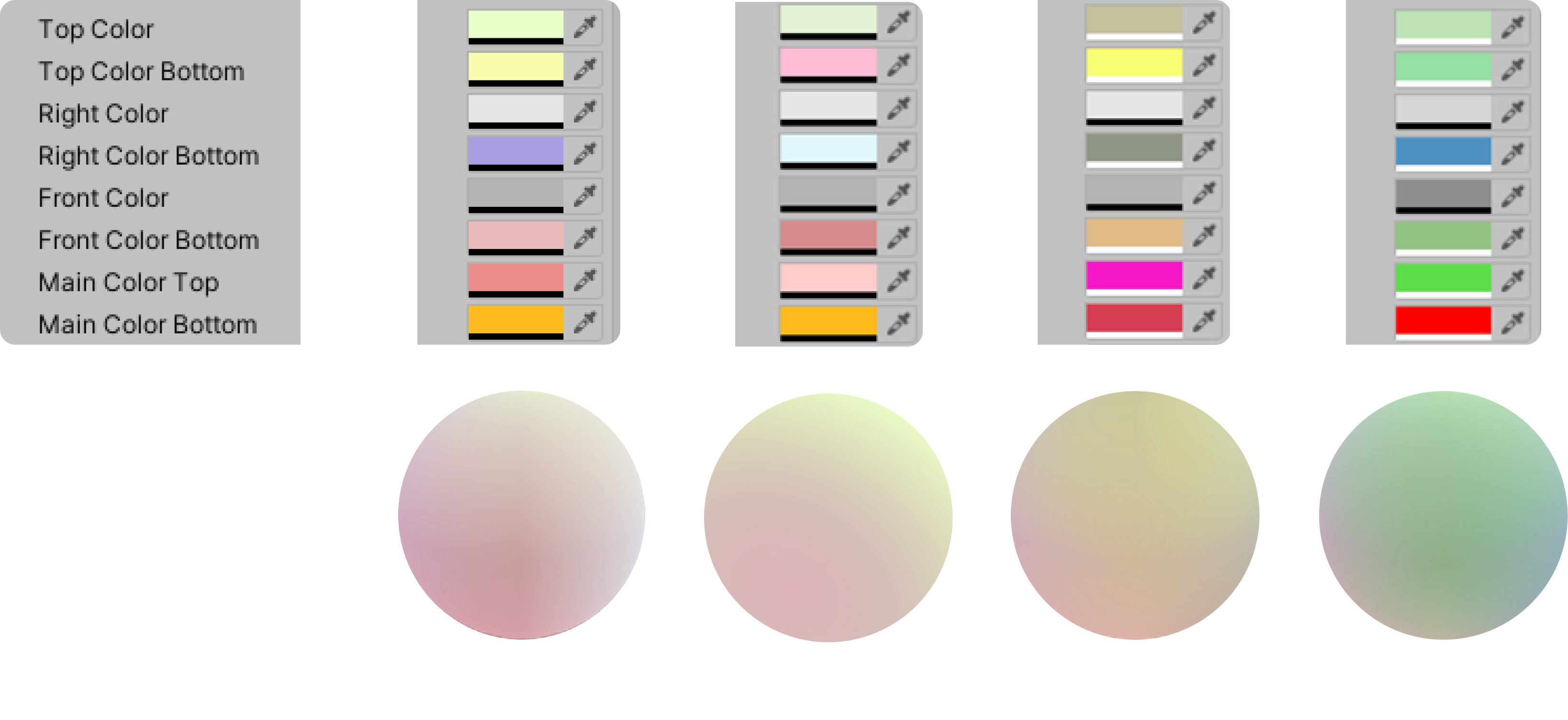
Material in Unity has a much wider range of control in display since it can be code to behave in a desired manner rather than follow a physical engine condition in some rendering software. Based on my previous color study, I set up 8 material section to for specific color fills. With some small tweaks, there are 4 versions produces. Here are the screenshots from Unity material properties menu and their associate material ball preview.
Beyond settling with colors of generic objects, I start to choose the environment elements and decide on their material texture and colors. I came up with three ideas:
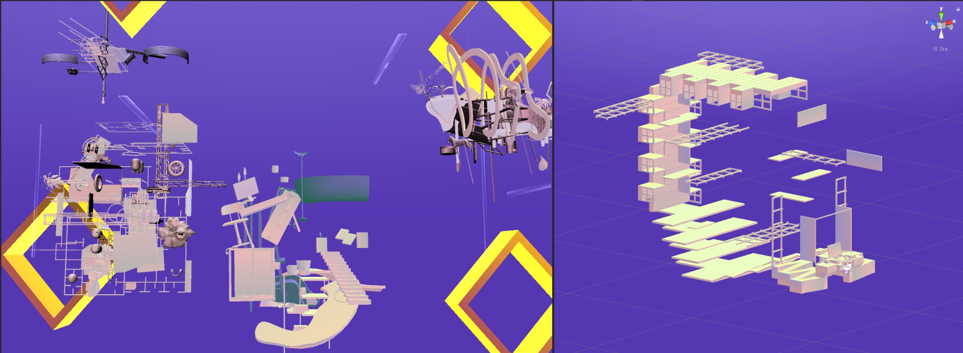
One was use complementary colors to make the objects stand out. I was using the complementary color purple coming of the gold orange gate threshold.
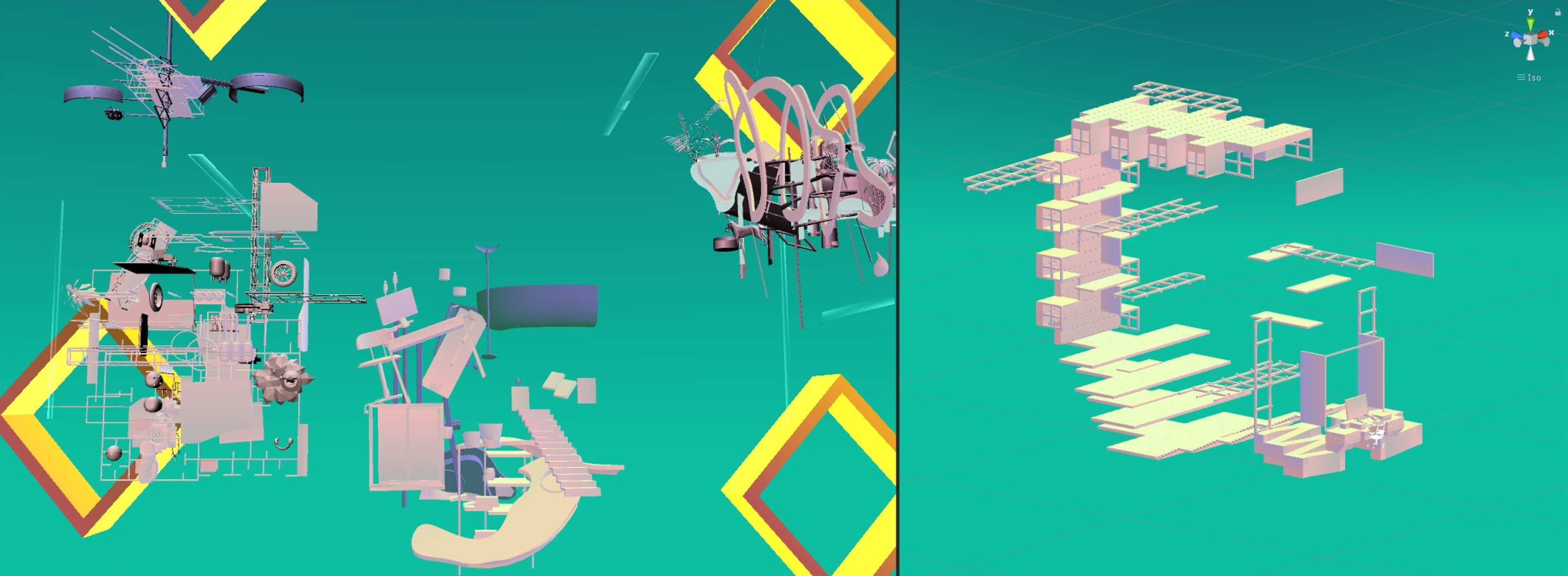
Second one is to use a analogues color which both close to the object color and the gate color, this also emphasized on a distinction between environment and objects.
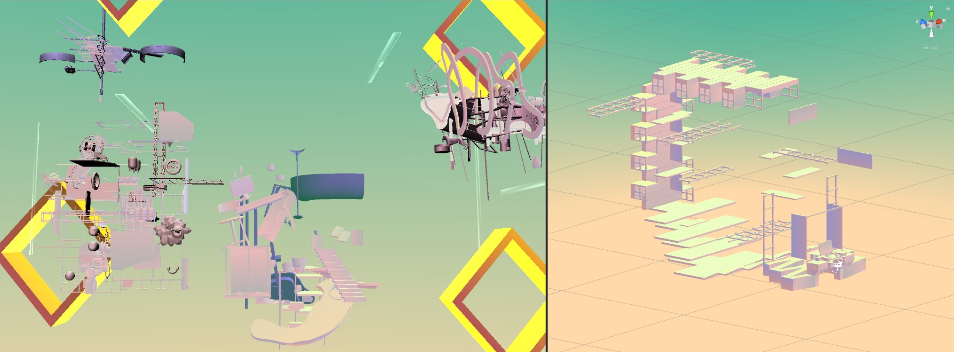
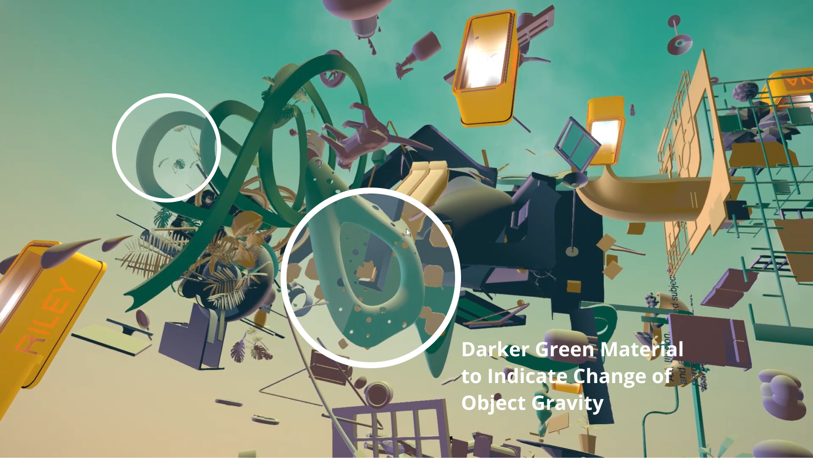
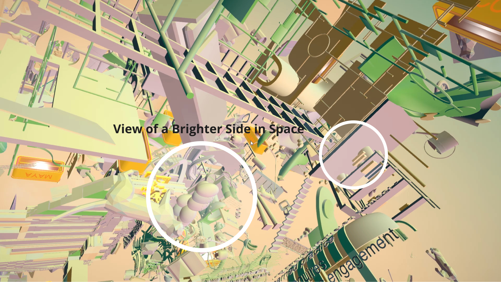
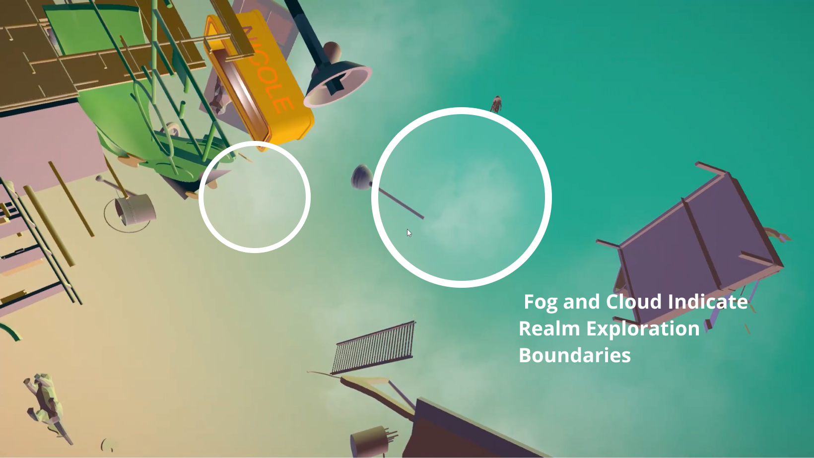
However, then I realized that the goal is not to have the object so distinct. The feeling of a fused boundary can better render the atmosphere of a dreamy feeling. So I came up with a gradient solution and plan to add in fog or cloud to create atmosphere.
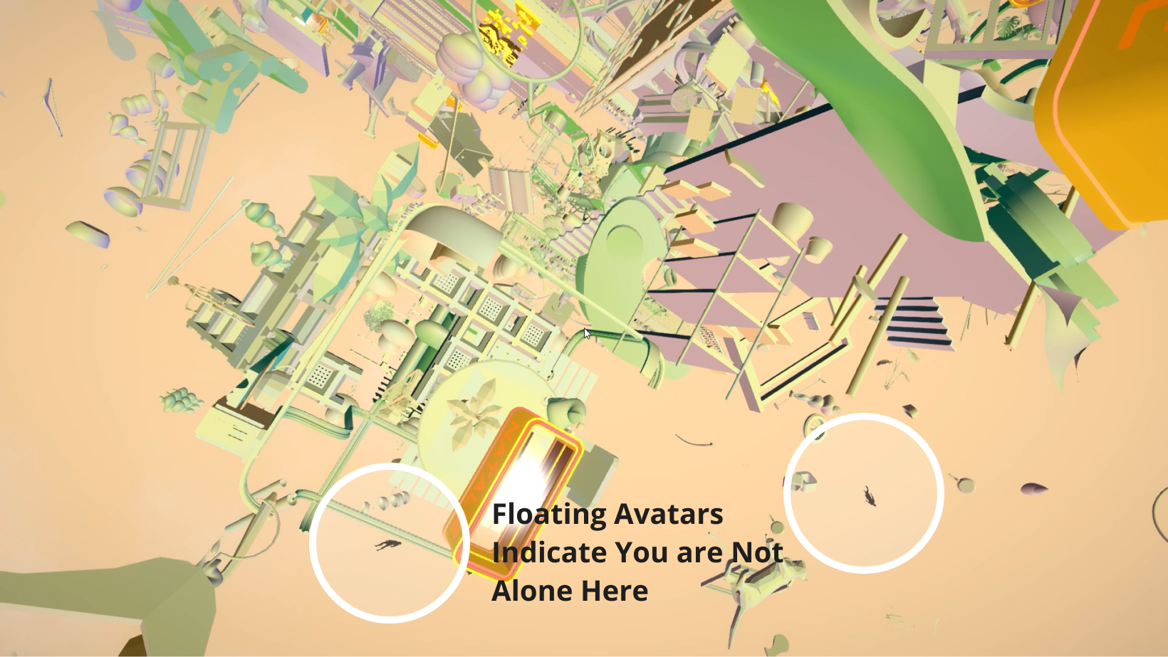
The final design in a joint effort of Jackson Studio 2020, where all the objects are created and put in by all 15 members and fine tune by everyone to the level of completion.